


Problem Statement
Silence is rare in an ever-growing, loud, and fast-paced digital world. With more access to constant media, finding peace is difficult and not as sought out because of fear. The challenge is to shift perceptions and to make silence aspirational rather than intimidating.

Research
What is Noise: Noise is an editorial project that explores the effect of constant noise in our fast-paced digital world. Silence is rare and often feared. The editorial aims to educate audiences on the benefits of mindfulness and intentional silence by emphasizing the harms of noise and overstimulation. The project targets young adults (18-30) who struggle with media reliance and digital overload and professionals (25-45) seeking sustainable self-care and work-life balance. Through unique visuals, the editorial will use imagery and typography that contrast with messages of stillness. The goal is to challenge perceptions of silence as awkward or unsettling. The deliverables include three editorial spreads, magazine mock-ups, a potential awareness poster, and a documentary video.
VISUAL IDENTITY: The visual identity takes inspiration from Swiss design principles by using clarity and structure. A consistent typographic hierarchy relies on bold weights, spacing, and alignment to guide the reader. Striking imagery is paired with a strict grid system which maintains balance and order. Generous white space, also inspired by Swiss design, allows elements to breathe, while a limited colour palette keeps modernity, contrast, and readability.
Process work
Colour Palette
Black symbolizes silence and calm, while white noise represents overstimulation and constant media input. This contrast inspired a simple palette for the editorial design, reinforcing its theme of mindfulness over noise. Pink was chosen to correlate with pink noise has loud low frequencies and quiet high frequencies, which mask other sounds. It is helpful for sleep, focus, and relaxation since it sounds like rainfall or rustling leaves. This noise type filters out distractions like people talking, cars going by, and the hum of electronics for better focus.
Logo
A modern logo wordmark reading “STILL,” created for a conceptual editorial company focused on health and wellness.

Posters
Each of the three posters features a different layout, combining editorial images and key quotes.


Print Editorial
For digital applications, recurring textures were carried into social media posts with dynamic layouts and a unified web banner.


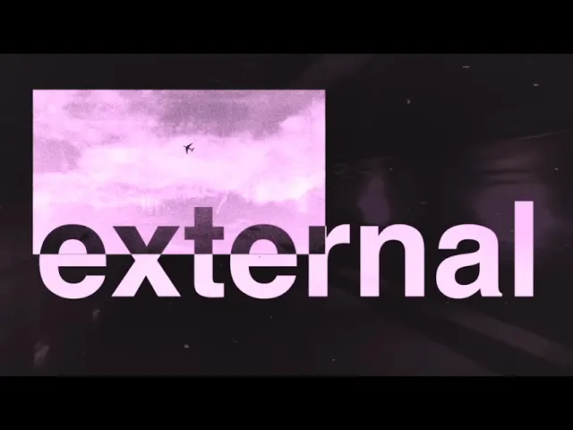
Documentary
This motion graphic uses abstraction, texture, and rhythm to symbolize noise. Using layered visuals, distortion, and high-contrast imagery translates the experience of constant media input. The pacing shifts between bursts and calm pauses, showing the impact of noise on focus and mindfulness. This piece is a sensory exploration and symbolism of stillness in a loud world.