Arca Marketing Campaign

Arca Marketing Campaign

A luxury marketing design for Arca that combines minimal, high-end layouts and elegant typography with subtle 2000s fashion-inspired visuals.

A luxury marketing design for Arca that combines minimal, high-end layouts and elegant typography with subtle 2000s fashion-inspired visuals.

Project Overview

This marketing campaign for Arca, a jewellery brand, includes a motion graphic, three social media posts, a coupon mailer, and a magazine ad. Cohesive design elements of blue-toned grunge aesthetics and metallic textures tie materials together. A tactile mailer includes a metallic seal and a seed paper coupon. A minimalist magazine ad shows the jewelry through collage and distressing techniques. Social media posts use abstraction and mystery. A dynamic motion graphic reinforces brand identity with metallic visuals, suspenseful audio, and a call to action.
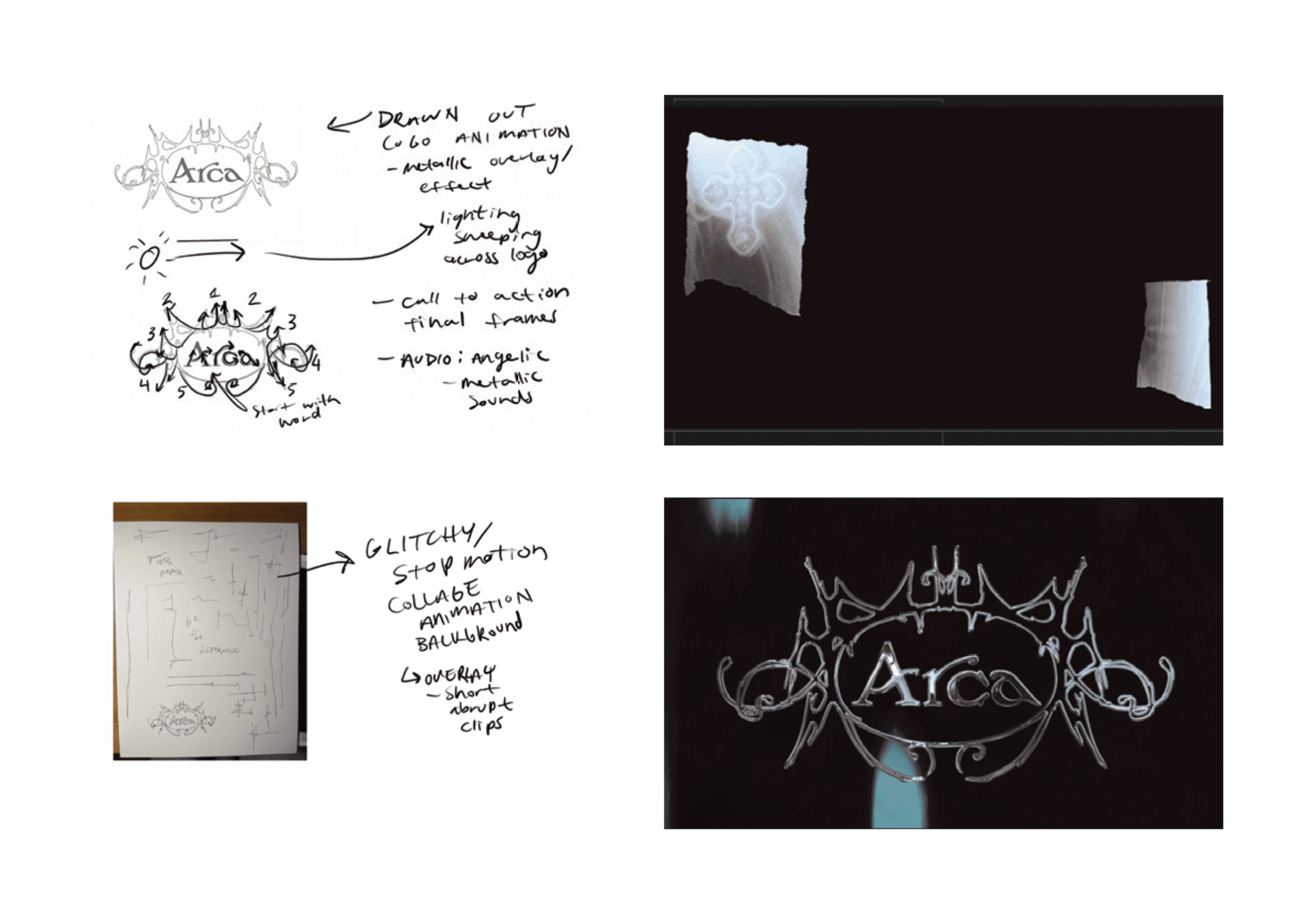
This dynamic motion graphic reinforces the brand identity through metallic visuals, suspenseful audio, and a strong call to action.

Brand Visuals

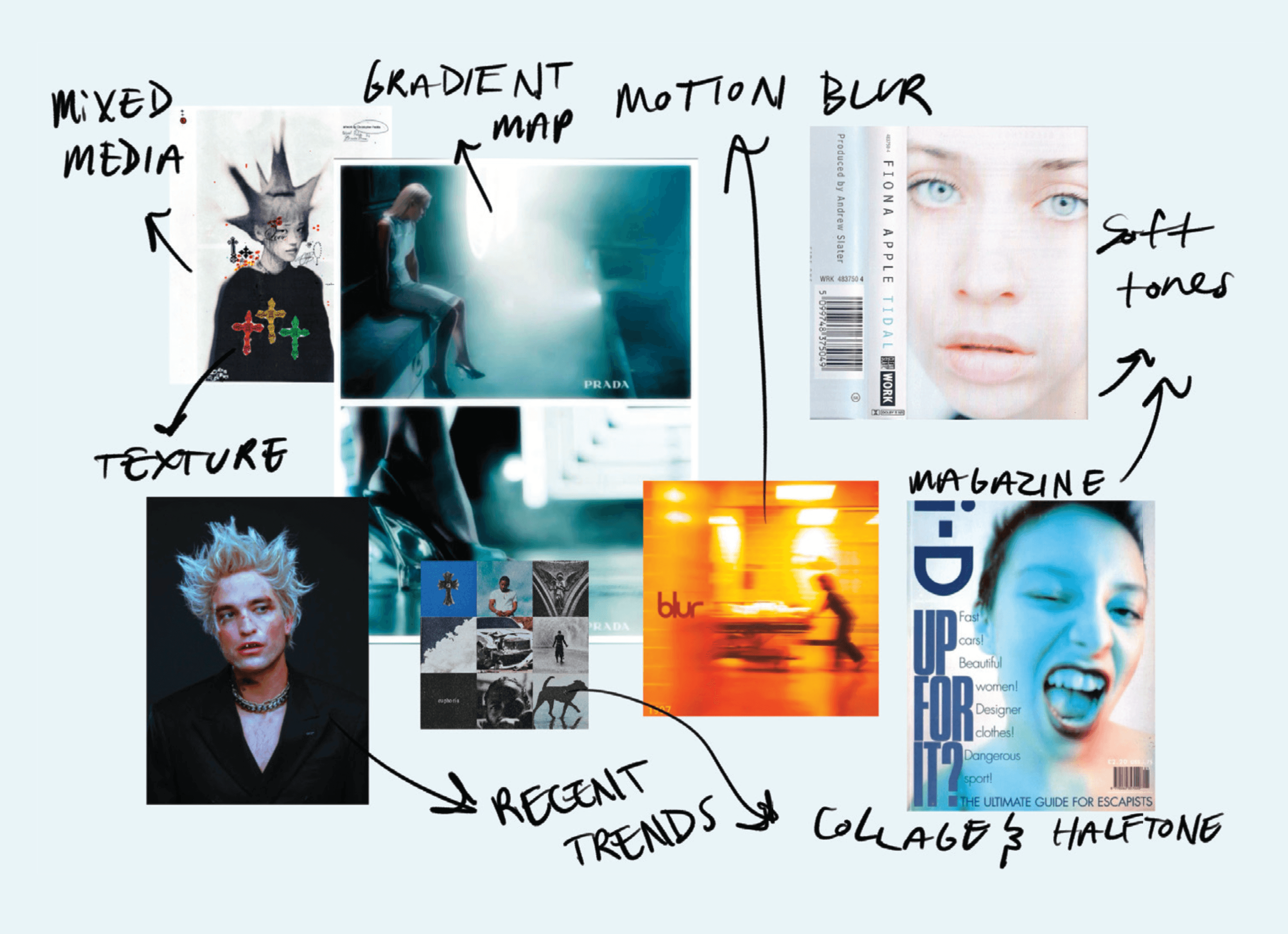
Graphics are inspired by grotesque European illustrations and ornamental organic forms, blended with early 2000s Gen X Soft Club aesthetics, using soft cool tones, grunge textures, and low-fidelity 3D “old game” styling.

Social Media

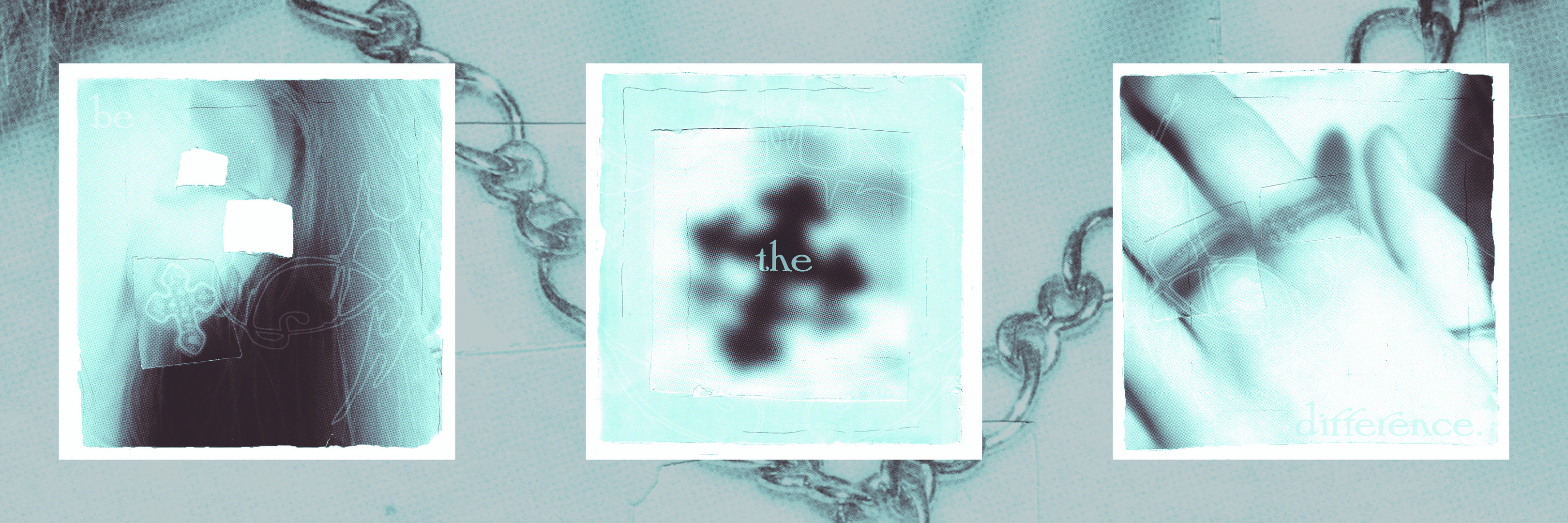
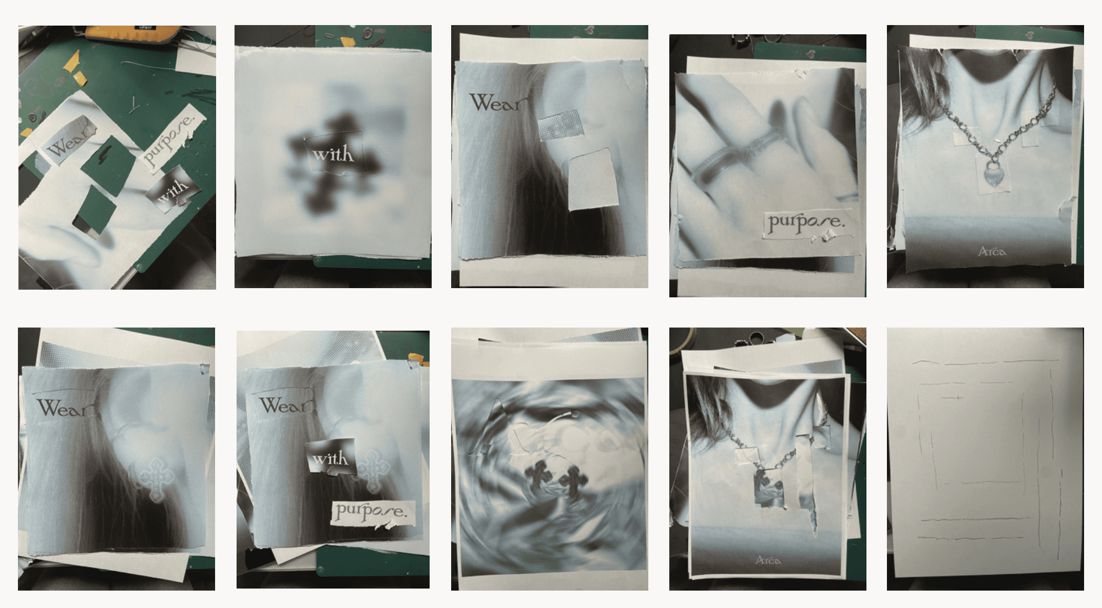
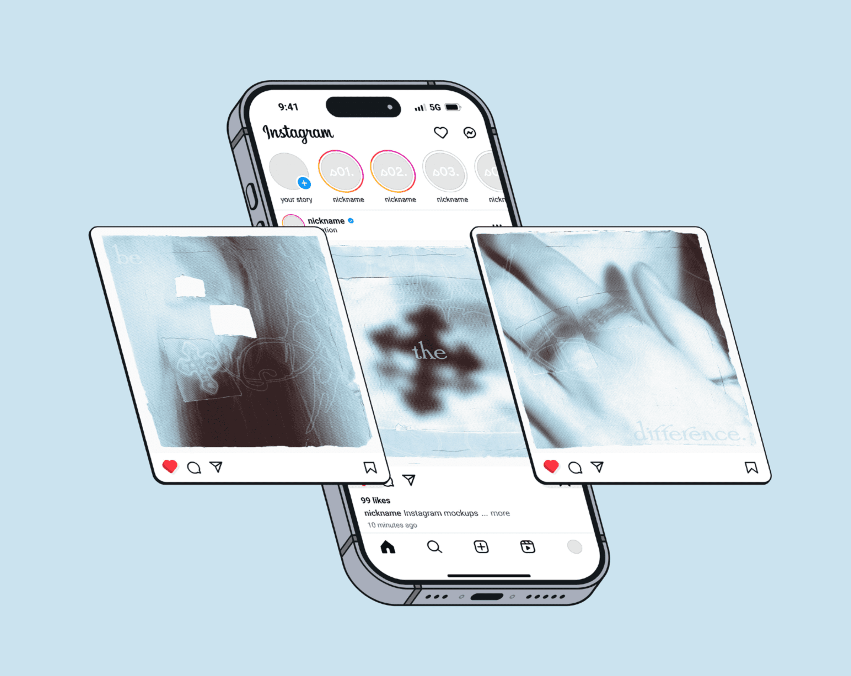
Social media content combines photography and rescanned imagery for added texture, paired with the call to action “Be the Difference.”

Coupon Mailer

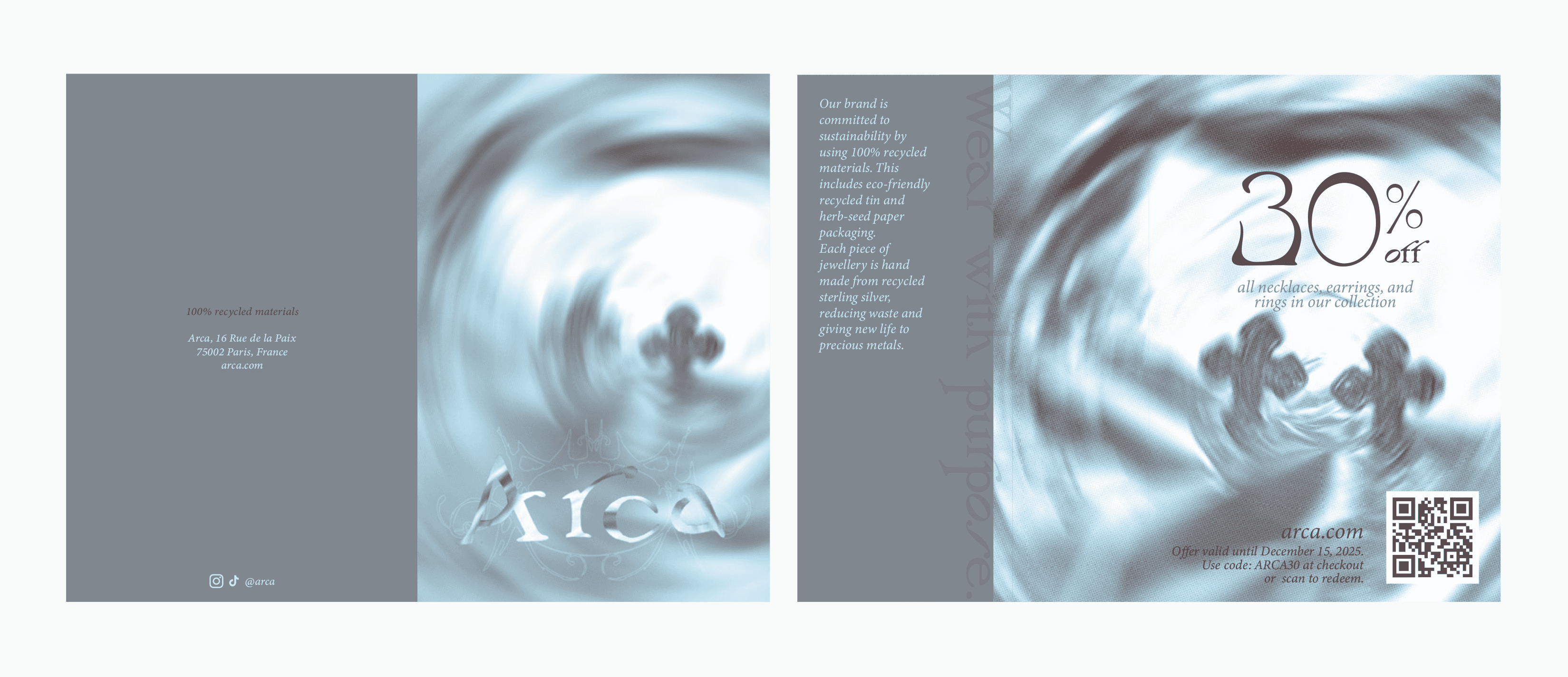
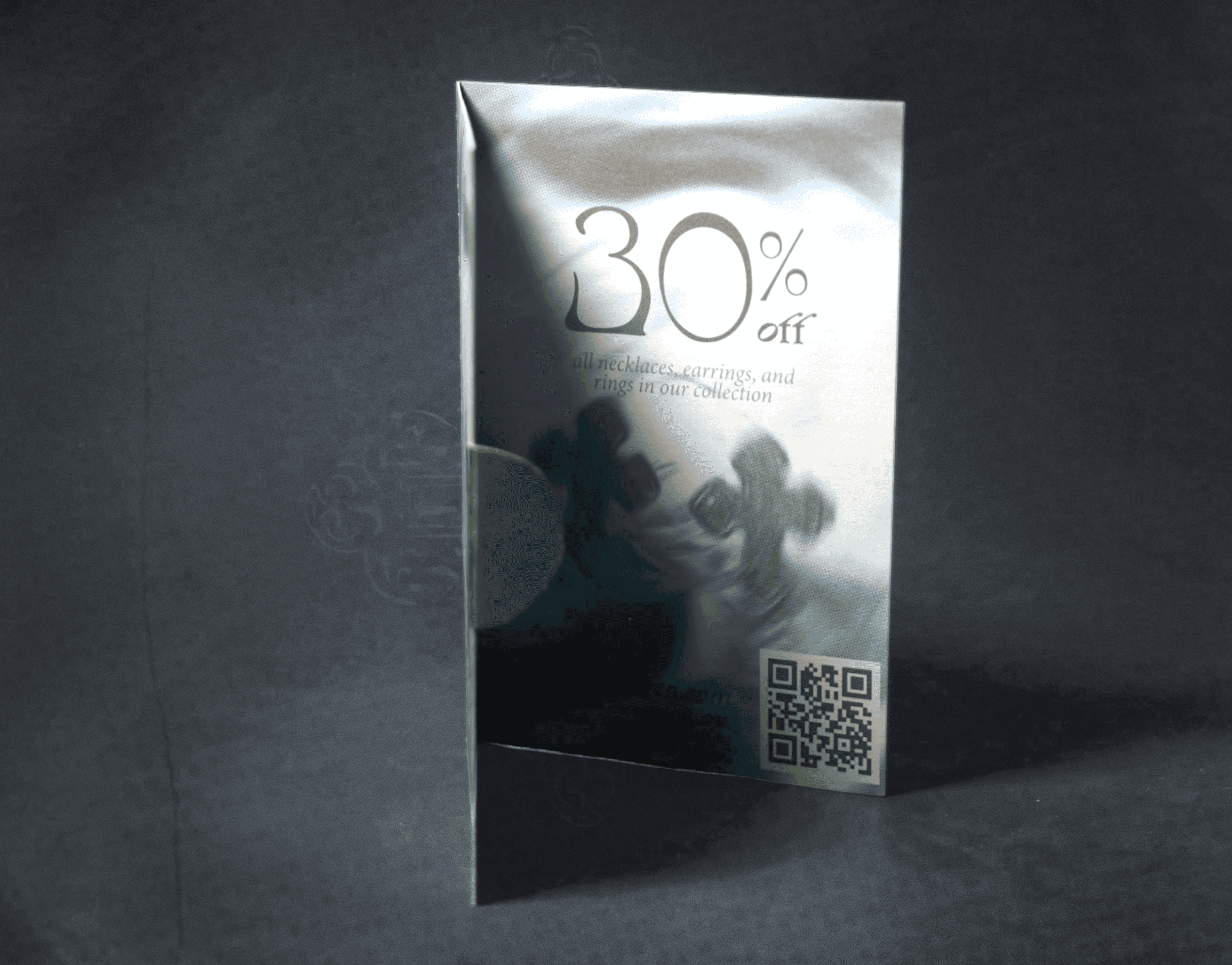
The coupon mailer features overlapping, blurred product visuals and a metallic paper seal embellishment that reinforces the Arcas' jewellery-focused identity.

Magazine Ad

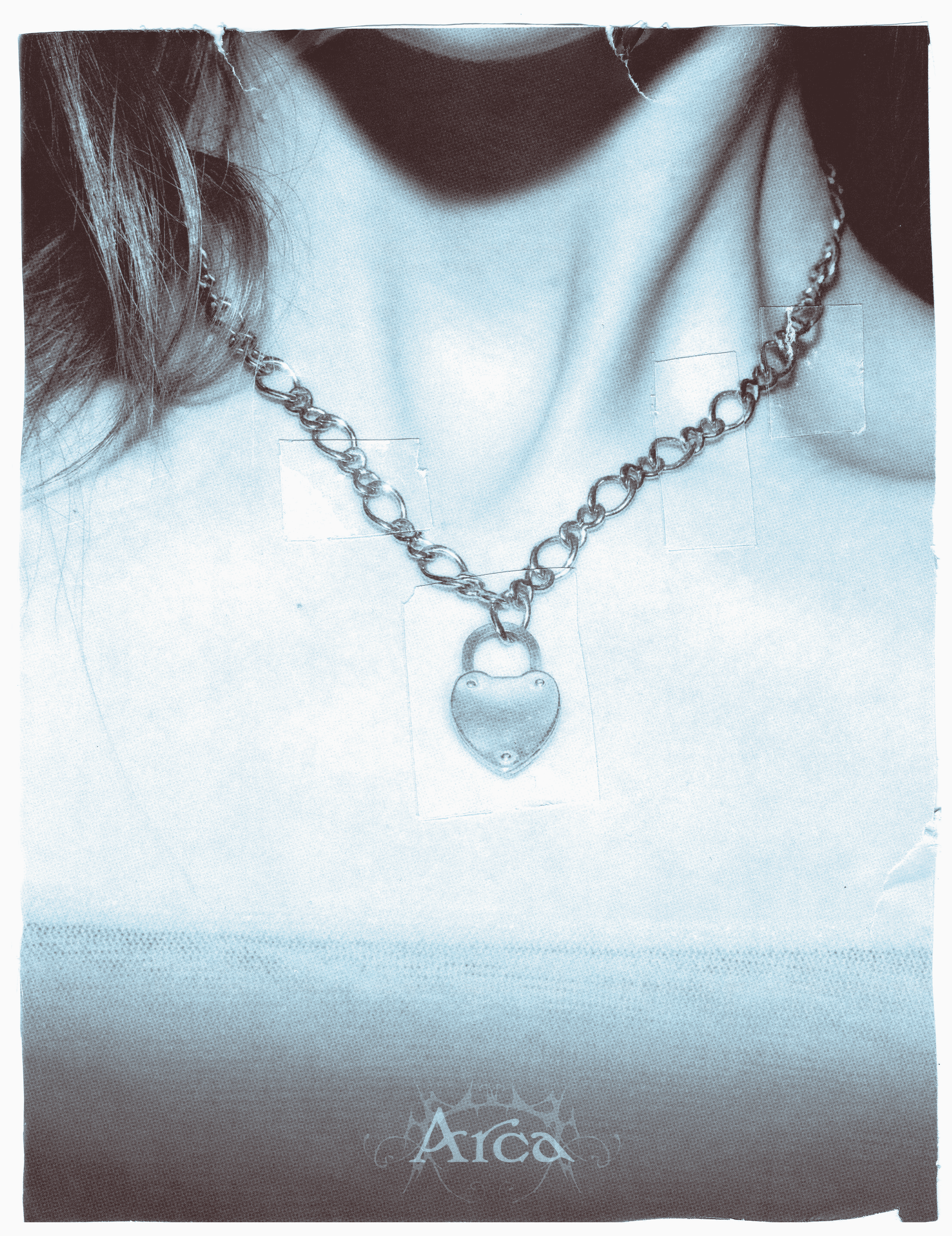
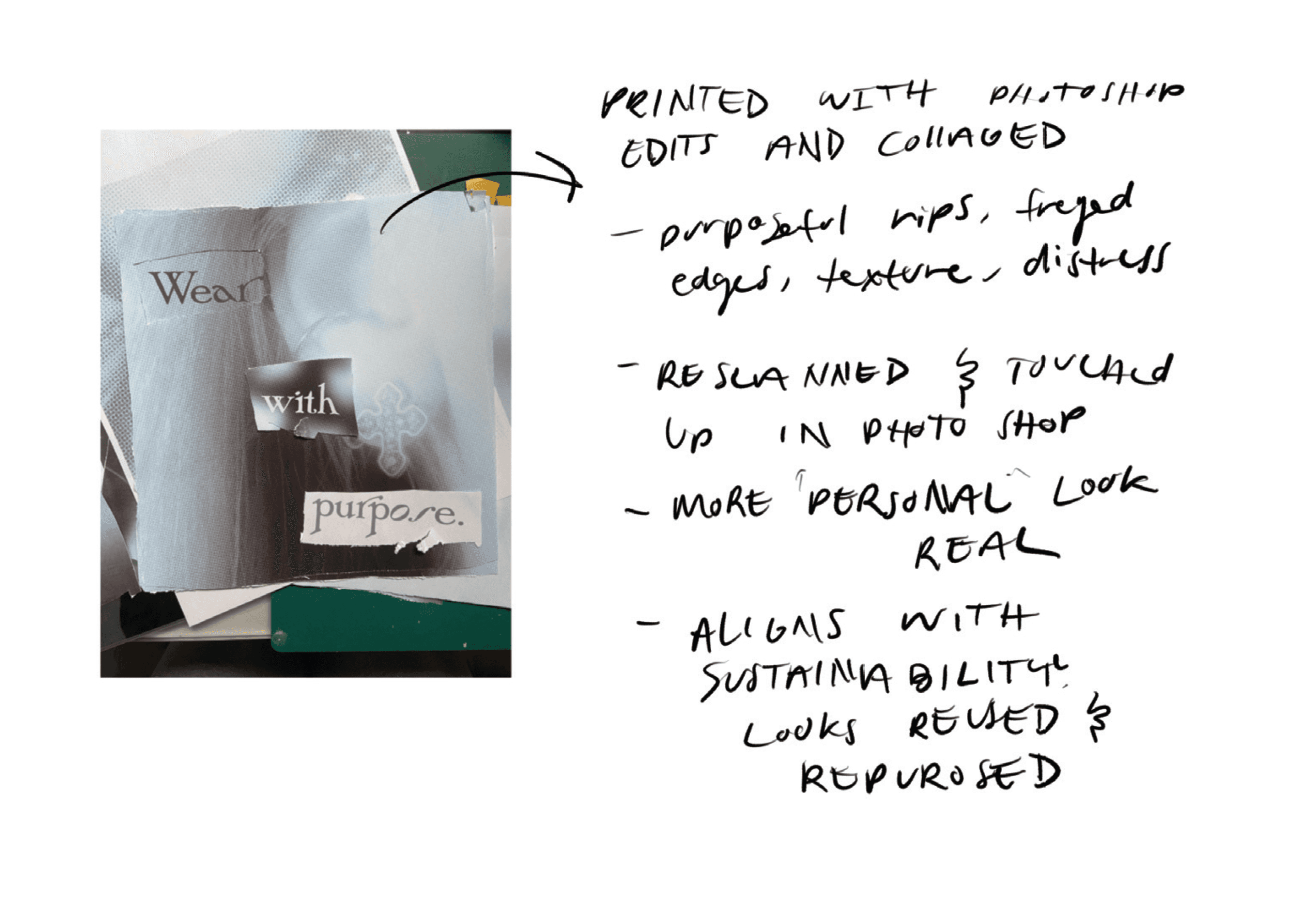
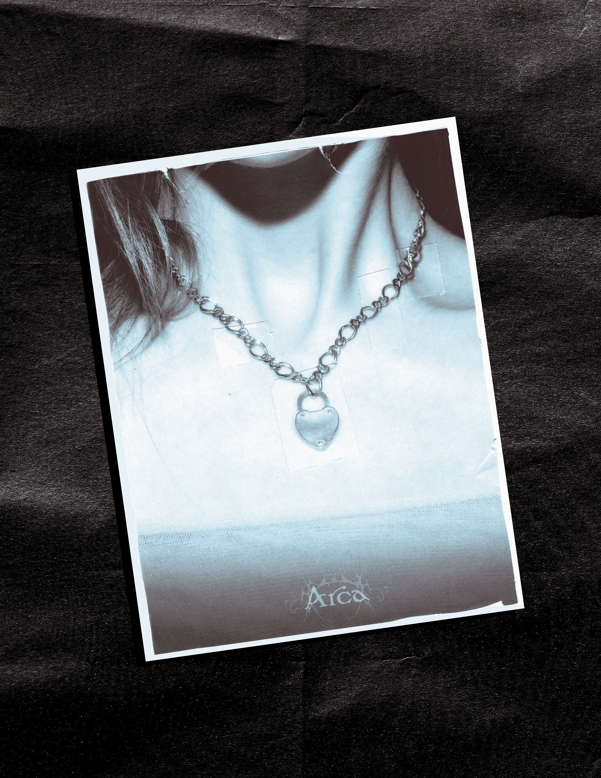
The magazine ad utilizes a full-page image with minimal typography, featuring only the brand name, inspired by the simplicity and elegance of luxury fashion advertisements. Small square cutouts are collaged and layered onto the composition to highlight and draw focus to the product.

Let’s Chat!

Let’s Chat!

Let’s Chat!